

Blog
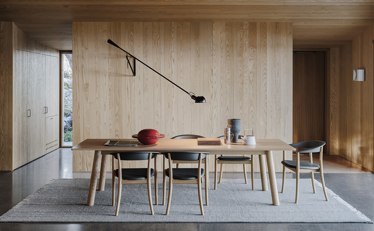
Ethimo mountain style

Price range: ₹32,672.00 through ₹74,045.00
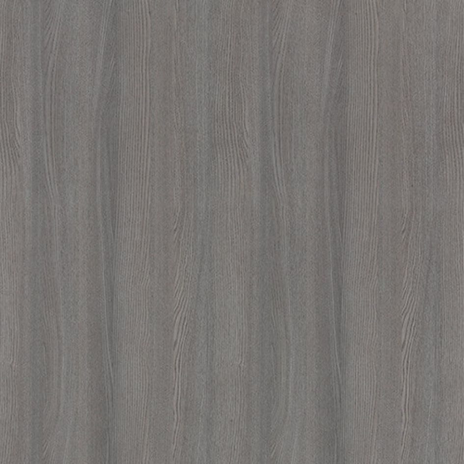 Ash (Grey)
 Beech (Beige)
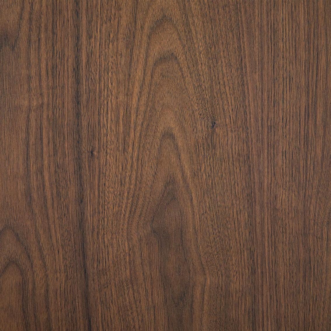
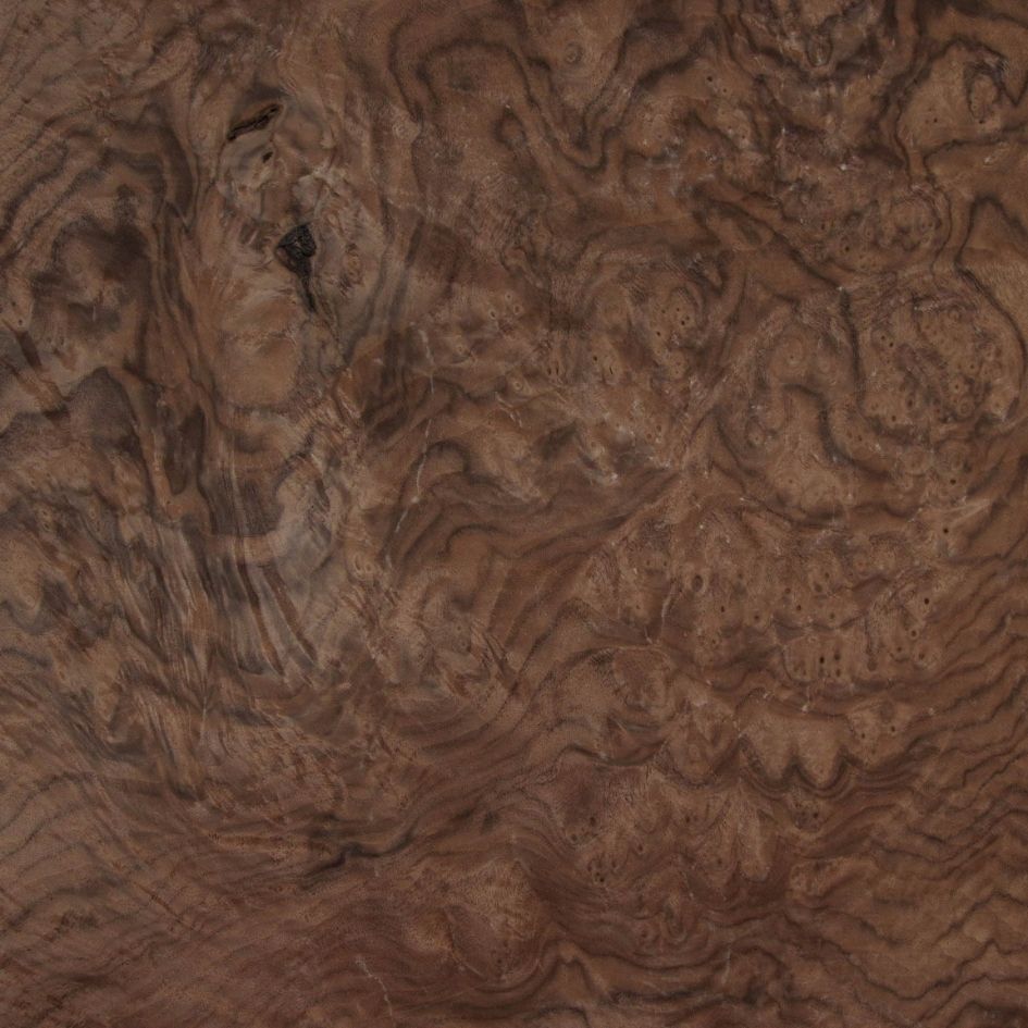 Walnut Burl (Deep Brown)
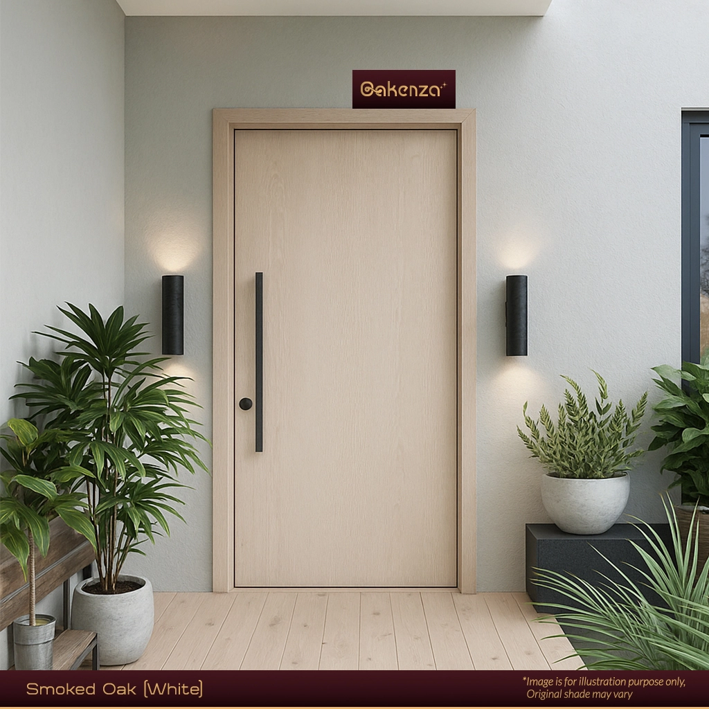
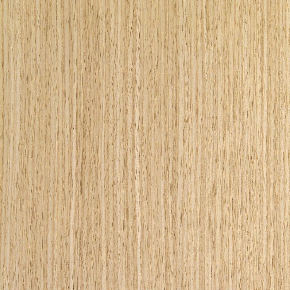
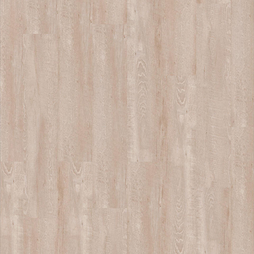 Smoked Oak (White)
Ash (Grey)
Beech (Beige)
Walnut Burl (Deep Brown)
Smoked Oak (White)
Price range: ₹46,538.00 through ₹95,865.00
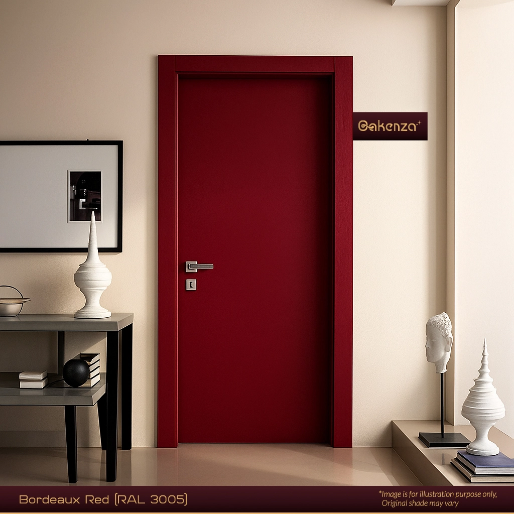
 Bordeaux Red (RAL 3005)
 Champagne Gold (RAL 9080)
 Deep Forest Green (RAL 6003)
 Graphite Grey (RAL 7024)
 Pearl White (RAL 9003)
 Piano Black (RAL 9005)
 Plum Maroon (RAL 4004)
 Regal Navy Blue (RAL 5008)
 Taupe Brown (RAL 7006)
Bordeaux Red (RAL 3005)
Champagne Gold (RAL 9080)
Deep Forest Green (RAL 6003)
Graphite Grey (RAL 7024)
+5
Pearl White (RAL 9003)
Piano Black (RAL 9005)
Plum Maroon (RAL 4004)
Regal Navy Blue (RAL 5008)
Taupe Brown (RAL 7006)
Price range: ₹53,821.00 through ₹119,186.00
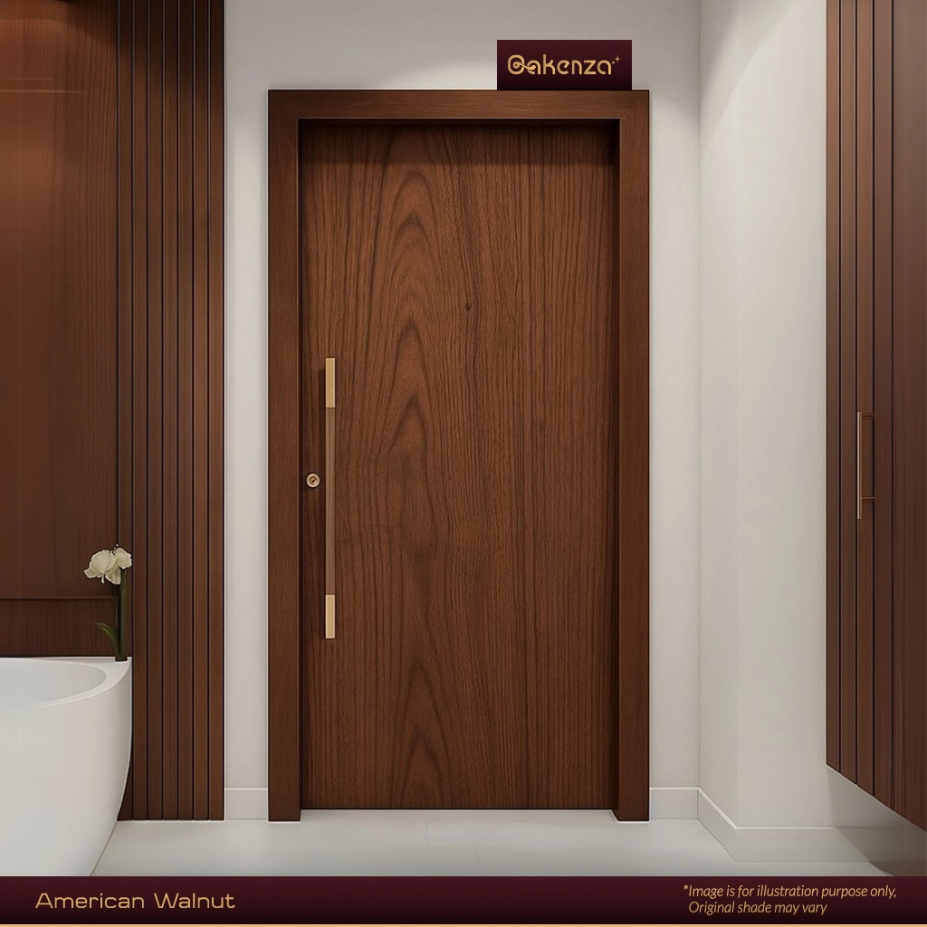
 American Walnut
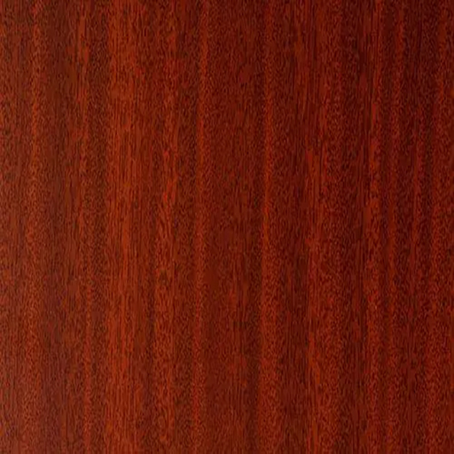 Mahogany
 Smoked Oak
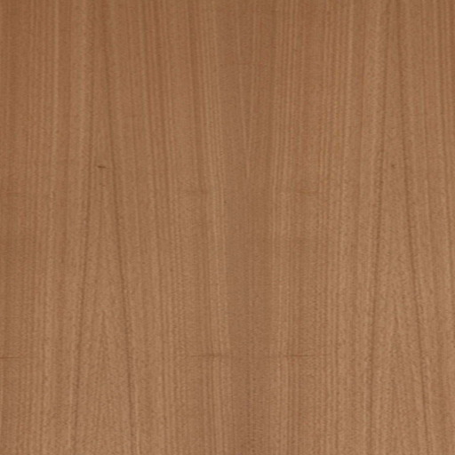 Teak (Natural/Golden Teak)
American Walnut
Mahogany
Smoked Oak
Teak (Natural/Golden Teak)

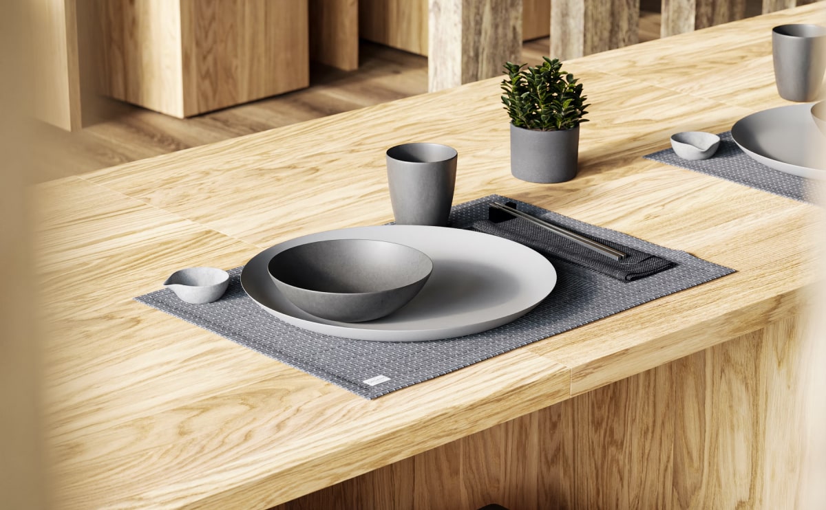
Price range: ₹7,500.00 through ₹10,500.00
Related Posts
In the heart of Valencia
As an alternative theory, (and because Latin scholars do this sort of thing) someone tracked down a ...

The clean series
So when is it okay to use lorem ipsum? First, lorem ipsum works well for staging. It’s like the prop...